Step into the world of Mrs. XO, where tradition meets modernity in a flavorful journey through Pan-Asian cuisine. The name
“Mrs. XO” embodies the essence of our restaurant – a place where the warmth of home-cooked meals meets the excitement
of culinary innovation. “Mrs.” invokes a sense of familiarity and authenticity, while “XO” hints at secret recipes and culinary
delights, inviting guests to savor every moment. This fusion of tradition and modernity ensures that Mrs. XO is not just a
restaurant but an experience, appealing to a diverse audience with its captivating story.
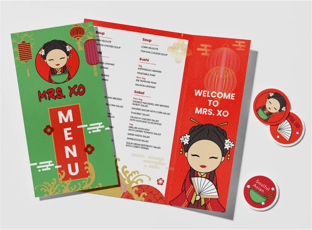
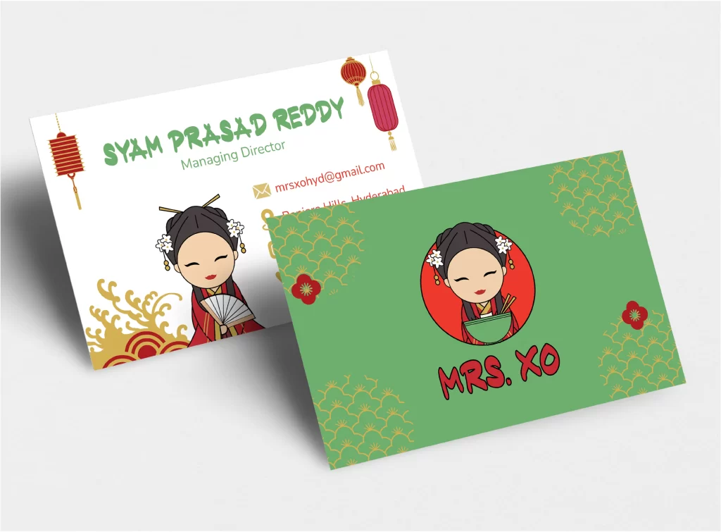
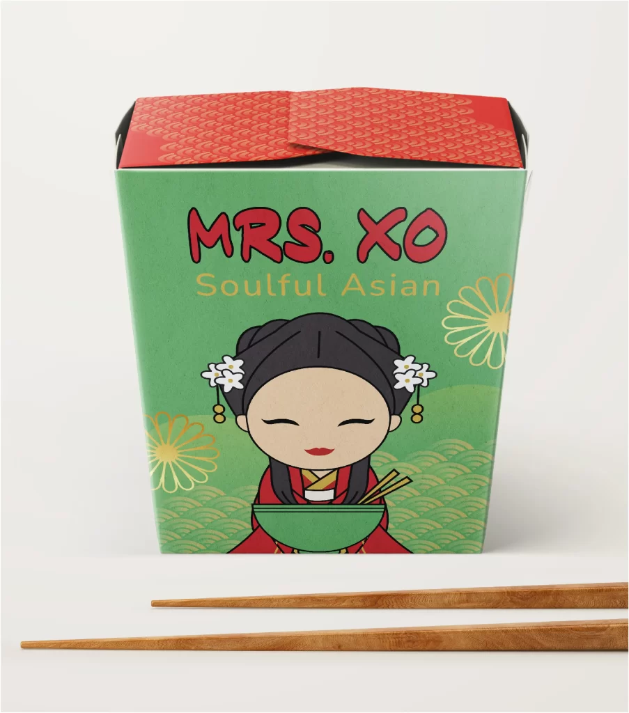
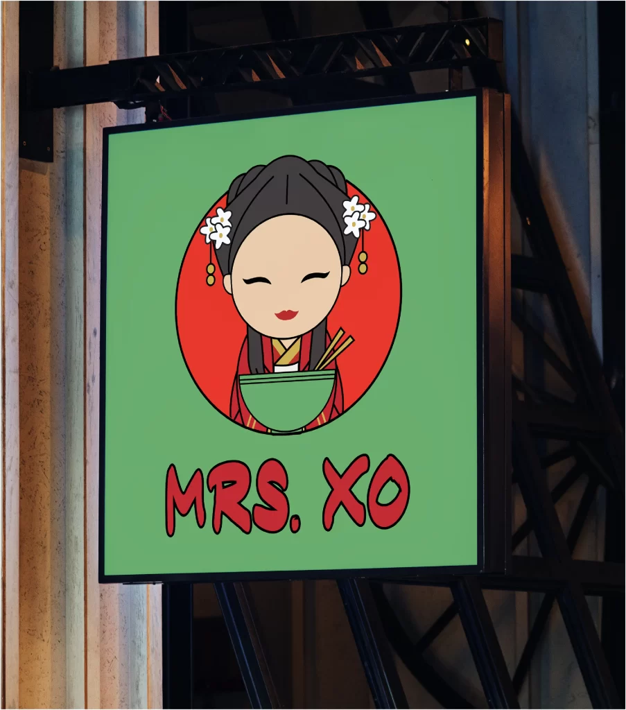
Our logo design for Mrs. XO reflects the vibrant spirit of our brand, drawing inspiration from both Asian culture and
contemporary flair. The harmonious color palette we’ve chosen is a tapestry of flavors and emotions. The dominant red circle
symbolizes fortune and joy, enveloping guests in a welcoming embrace. Black hair represents our authentic roots, while the
green bowl signifies freshness and the use of organic ingredients. Gold accents add an air of elegance and suggest the premium
quality of our cuisine. The vivid red “MRS. XO” text exudes energy and passion, while playful shapes promise a modern and
friendly dining experience.
For our character variations, we’ve crafted illustrations that capture the essence of Mrs. XO – a seasoned chef with a lifetime
of culinary mastery, depicted gracefully holding a traditional Chinese fan or enjoying various culinary delights. Each character
variation embodies joy and cultural richness, inviting guests to embark on a culinary adventure with us.