Roamify
Thought Process:
Our goal was to create a logo that encapsulated the essence of travel and adventure while reflecting the personalized service offered by Roamify. We brainstormed ideas around symbols of exploration and journeying, eventually settling on a design
that incorporated a location symbol with a plane circling around it, symbolizing the ability to customize itineraries worldwide.
Design Idea:
We opted for a clean and modern design to ensure versatility and timeless appeal. The combination of the location symbol
and the plane conveys the idea of seamless travel arrangements, while the globe at the center reinforces the global reach of
Roamify’s services.
Color Palette:
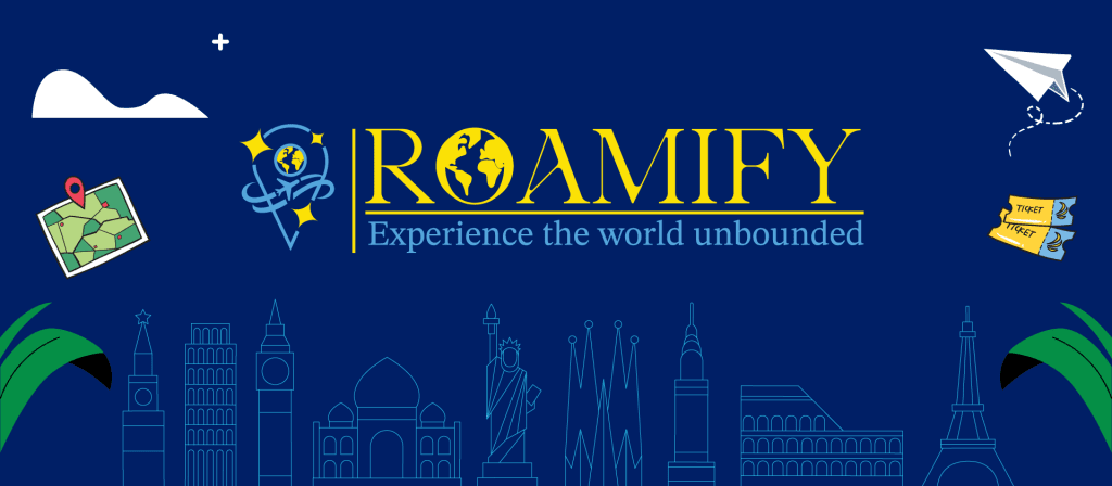
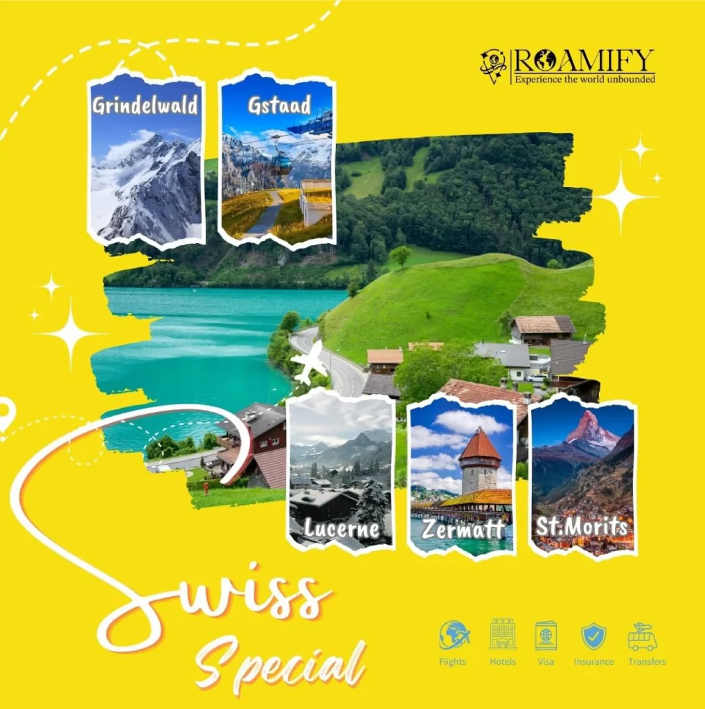
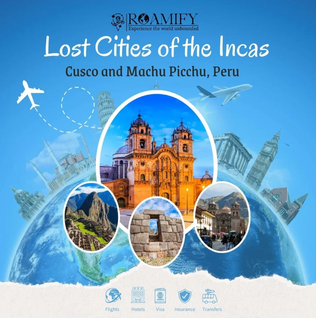
The choice of blue and yellow was
intentional, as blue represents trust, reliability, and the vastness of the sky, while
yellow evokes feelings of optimism, energy,
and warmth. Together, these colors create a
sense of excitement and possibility,
perfectly mirroring the spirit of travel
and adventure.
Typography:
We selected the Ade Display font for its
elegant yet approachable serif style, which
adds a touch of sophistication to the logo.
The clean lines and balanced proportions of
the typography complement the overall
design aesthetic, ensuring legibility and
visual appeal across various platforms.
Execution:
With meticulous attention to detail, we brought our vision to life through precise
execution and refinement. Each element
of the logo was carefully crafted to
achieve harmony and balance, resulting in
a distinctive visual identity that embodies
the essence of Roamify’s brand.